The Review: 2019

Review32019

The Review, 2019, Vinyl, Paper, Ink and Acrylic on Card, 12×12 inches.

Design is something I want a career in, so creating this piece was a dream. Accompanying a piece of text, which was staged as lyrics, this album cover had to reflect its content – so, I went off to create something seemingly nostalgic, channelling psychedelic of the 1960s and 70s.

Paying attention to detail was key here, as I aimed for making this a piece of design work, and so it was of paramount importance for me to ensure that things like making the text uniform and checking the spacing was something I looked at; just making everything look as clean as possible.

I intend to produce a lot more design work than I currently am, particularly in the realm of graphic design.


Kaldi’s Discovery: 2019

Kaldi2019 (2)

Kaldi’s Discovery, 2019, Acrylic on Canvas, 16×16 inches.

This year I took part in the Coffee Art Project, held at the Truman Brewery in London. As part of the London Coffee Festival, the project is an opportunity for artists to get exposure as well as benefiting Project Waterfall. Rather unexpectedly, I received an email telling me I had been shortlisted, and so I would later go and visit my displayed work.

Here is what a wrote for my 100 word placard:

‘Depicting an excited-looking goat eyeing up a cup of java, this piece is based on the legend of Ethiopian Sufi Goatherder, Kaldi, who discovered the coffee when his goats became more energetic, after nibbling at a bush of bright berries. After proceeding to do so himself, his exhilaration led him to bring some back to a Sufi monastery, where a monk threw them into fire after disapproving their use. From the fire an enticing smell arose, so the roasted beans were quickly retrieved, ground and dissolved in water – producing coffee. My artwork is a fun take on this story.’

Duplication: 2019

Wallpaper12019

Duplication, 2019, Acrylic Printed on Paper, Dimensions Variable (Sample)

I’ve always found it hard to work on a large scale, it feels as if I don’t have as much control over it as I would with something like an A3 canvas. Working with wallpaper is something that sparked my interest when it was mentioned to me about a month ago, after I had presented some print ideas. I had made the prints not quite knowing what direction I would take them in, but later felt compelled to pursue this wallpaper idea. So I started here, making this fairly simple, monochrome print to grasp my bearings. What I have thought about since, is that each circle is different yet the same. Despite my best efforts to create repetition as accurately as possible, the fact that I am human and not a computer prevented each circle from being uniform, giving me my unique outcome – This reminds me of why I love art.

Salt and Coloured Light: 2019

Salt and Coloured Light, 2019, Tissue Paper, Paper, Coloured Acetate and Acrylic on Plastic, 11.69 x 16.53 inches.

Additional: Salt on Reinforced Tissue Paper, 8.27 x 11.69 inches (Left) Embroidery Thread on Felt (Right)

I made this piece in response to a material brief; it reflects my personal troubles when having a lack of control over things. The artwork must be placed up to light in order to explore the full depths of it. Its compactness symbolises a sort of comfort zone for me, holding in the things that I have complete control over. My experimental additions for this project have opened up the realm of repetition in my work, which I am pursuing in current projects.

Untitled: 2018

crucifixtion2018

Untitled, 2018, Acrylic, Mod Podge and Permanent Marker on Glass (Framed), 19×14 inches.

When carrying out some research for a new project, I stumbled across multiple tweets where people had gone and taken highly controversial selfies in places such as Auschwitz concentration camp, the 9/11 memorial and even Chernobyl. There were also many articles surrounding the fact that people have literally died from risking their lives to get a selfie. This urged me to produce some art on the topic of ‘selfie culture’ and the lengths people will go to get one.

My altered design of a traditional stained glass window comments on selfie culture and challenges how far people will go with this obsession before it becomes disrespectful or offensive. The artwork is supposed to raise questions about the world we live in and social media. Would people take selfies in these situations if it was possible?


Pseudo Pig: 2018


Pseudo Pig, 2018, Driftwood and Screws, 23x13x9 inches.

Being more of a painter, it was somewhat daunting moving into the realm of sculpture although undertaking this project forced me to be creative in a different way. I have little experience in working with wood but for this piece I felt urged to work with this diverse material. The idea for Pseudo Pig sprouted from my set of ethics and values, along with being inspired by the work of Sally Matthews and Heather Jansch.

Sally Matthews, a British sculptor, looks widely at the anatomy of animals and capturing a sense of life in her work through her use of natural materials. Her work connects effortlessly with the organic settings in which she places it; this largely influenced my decision to work with a naturally occurring material as opposed to something man-made. I also noticed a statement on her website that sparked my interest: ‘I want my work to remind people of our need for animals and the example their nature provides us with’ – now whether this refers to the supposed need for animal consumption or just keeping the food chain in balance, I like that her work raises these kind of questions, which is what I wanted my own artwork to do.

The other British sculptor whose work I was drawn to was Heather Jansch, well-renowned for her life-sized sculptures of horses crafted from driftwood. She explains how she draws her inspiration from none other than Leonardo da Vinci; her work once again capturing life – and almost a sense of movement. Her sculptures hold a strong presence and have a striking impact on the observer. After seeing what she had created out of this beautiful material, I wanted to use it.

Using driftwood meant that the artwork would instantly have part of my own identity ingrained in it, as I have lived by the sea my whole life. I really love everything about driftwood; its warped form and the fact that the wood has gone through a natural process to become this way – I also think it’s intriguing when considering its origin and how far it may have travelled.

The sculpture originally stood in the grounds of Writtle University in an space (that appeared to be untouched for a while) sheltered by some silver birch trees, with some long grass and scattered flowers in its company. This felt like the ideal setting for the artwork, somewhere with little intervention from man.

As a whole, my inanimate pig form reflects how people see the actual sentient beings as mere commodities. Additionally, it comments on the fact that we may not have nature in general for much longer if we carry on with the attitude we currently have. I wanted Pseudo Pig and its setting to symbolise how important nature is and to help people see why it is essential that we protect it while we still have it.

Damon: 2018

Damon2018
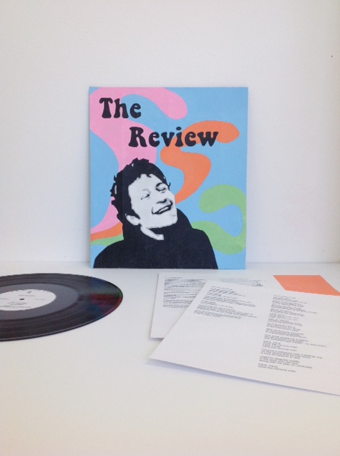
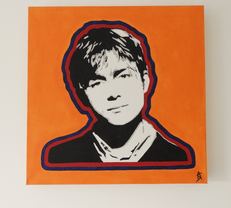
Damon, 2018, Acrylic on Canvas, 16×16 inches.

An acrylic painting I made of young Damon during his Blur days.

Blur or Oasis? I actually admire both bands, but Oasis was just missing something for me.

Albarn is another musician that has had a huge influence on my music taste. One of the first records I bought was a dodgy gold bootleg of Parklife. Blur represented Brit Pop in all its glory and following Blur’s success, Albarn pursued a multifaceted career, working on diverse side projects Gorillaz and The Good, the Bad and the Queen. I have so much admiration for all of his work, so I created this portrait of him.

Moz: 2017

Moz2017
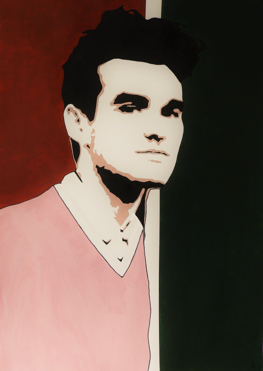
Moz, 2017, Acrylic on Paper, 11.69×16.53 inches.

One of my favourite musicians, created and made into a print, to be sold in my online shop.

Having been a music ‘atheist’ for so long, discovering The Smiths (and solo Morrissey) opened me up to a whole new range of music in my early teens. I hated everything I heard on the radio and wondered why I couldn’t stand what everyone else loved so much. I still feel very much this way about it and if it hadn’t of been for bands like the Smiths my world would be a very quiet and boring one.

Rob: 2017

Rob2017
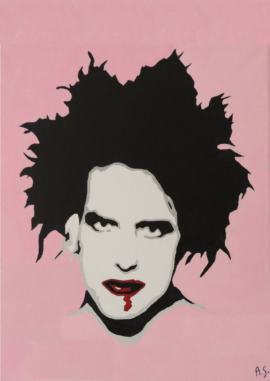
Rob, 2017, Acrylic on Canvas, 9×12 inches.

The Cure’s Robert Smith, created and made into a print, available to purchase.

I have wanted to paint Smith for a while – I love The Cure and so I came up with this. One day I was going through my collection of NME magazines, (which now cease to exist) and found a great cover with Robert’s face on it. It was him plastered in his goth makeup, looking straight at the camera. Referencing this image, I had to paint this truly brilliant musician.

Untitled: Sculpture Based on Consumerism 2017

Untitled, 2017, Wood, Card, Plastic, Tissue Paper, Net and Textiles, Dimensions Variable.

Prior to materialising this sculpture, I had been thinking lots about the power of advertising and consumerism itself – along with the impact these things have on the world. I proceeded to use this as a springboard for a new artwork and undertook this project with the intention to try and produce something completely different – so, creating a sculpture as opposed to my preferred form of a 2D piece felt like a good place to start.

Inspired by Banky’s harrowing but powerful Siren of the Lambs, my sculpture’s purpose is to almost speak to the viewer; revealing bit by bit the detrimental effects of animal product consumerism. I wanted to uncover just how desensitised we have become as humans to the reality of products and their production processes through the power of branding and advertising. McDonald’s felt like the appropriate company to base the ‘rebranded’ packaging designs off of since it is one of the biggest fast food chains in the world and gets through an unthinkable amount of animals everyday.

The factual information I used to get the messages across are revealed to the viewer when they pick up and read the text written on each part of the containers. The information targets ethical and moral issues, covering topics on environmental effects and animal-cruelty in the meat and dairy industry.

The concept of my artwork as a whole is to induce thought – I am deeply curious about the viewer’s reaction to seeing this shocking information on the side of food packaging, instead of enticing descriptors labelled in place of the truth; along with bluntly revealing to them the animal slaughter and exploitation that coincides, hence the placement of the stuffed animals with sad expressions stitched upon their faces.